
The team member who’s always sneaking sports on to his computer screen, Brandwave Creative Daniel “Tommo” Tomlinson knows a little bit about watching live sports. In this blog he discusses Sky Sports’ new look and how it ties into the wider market trend of creating more customised products, specific to each consumer.
With online streaming services like Netflix becoming ever more popular and video on demand becoming the norm, consumers are now expecting what they want, when they want. Without growing and moving with the times, TV channels risk becoming obsolete, so it goes without saying if you want to stay ahead of the game, you have to start rethinking exactly what you’re offering your consumers.
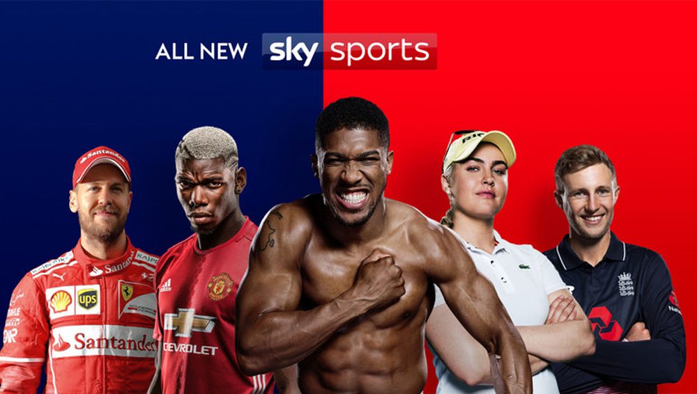
On the 18th July 2017 Sky Sports implemented one of the biggest changes in its twenty-six-year history. Nine brand new channels, each dedicating themselves to specific sports, with the vision being that Sky consumers only pay for the sports that they love and that they have complete control over what is shown.
As an avid sports fan, initially I was excited about this but somewhat uncertain. Was this another ploy by Sky to make more money? Or were they actually thinking about the consumer’s viewing experience? As a passionate footballer and golfer I was keen to view just what I want and when I want it, and not have to scroll through five channels to find it.
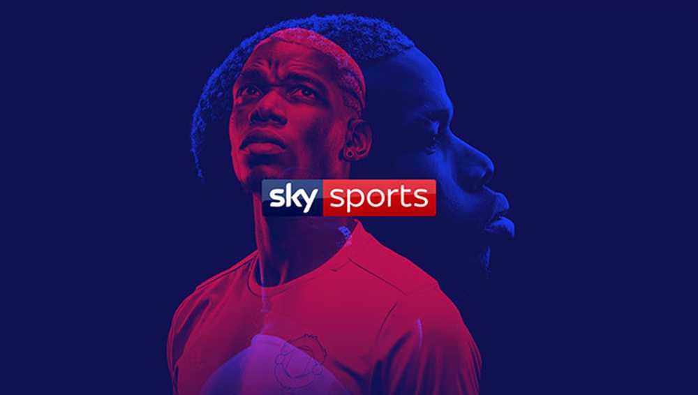
Not only have the channels been massively revamped, but the whole Sky Sports brand from top to bottom; from the logo to hero photography to the set designs you see on TV. A major priority was how each digital asset was going to work on every screen as people are watching more on their phones or tablets than previous years, especially with Sky Go now available. This was something they had to take into account when coming to design for these devices.
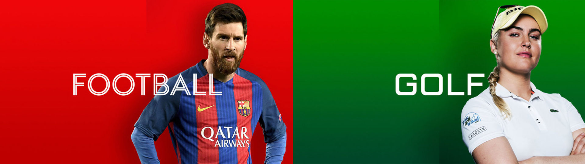
With Swiss Typefaces, the new branding moves away from uppercase to be simple and more refined. The five cut font captures the essence of each sport such as; F1 being technical, golf being about focus and precision and football being authentic and contrasting. The channel identities are allowed to be flexible across all media to express their unique personalities.
A major change was imagery used throughout. This redesign was to move away from the cliché celebratory moments they had used quite a lot last year, to really show you the real grit and passion as well as disappointments from every sport.
In my personal opinion I really like what Sky have done. The slightly adapted logo is vibrant and sharp, the typeface is super clean as well as being easy to identify. The fact that each cut is specific to an individual sport is an idea I love. Giving each sport it’s own personal identity to make it feel unique and to give the viewer familiarity of their chosen sport. Everything is very neat and clear as well as the photography being incredibly engaging.

All photo credit to Sky Sports